
Hive Institute
2016 / Brand, Identity, & Exhibition Design
Hive Institute is an imaginary museum that was conceived through a collaboration between the Graphic Design, MFA and Curatorial Practice, MFA programs at Maryland Institute College of Art (MICA). This collaboration paired graphic designers with curators to bring the curator's museum concept to life.
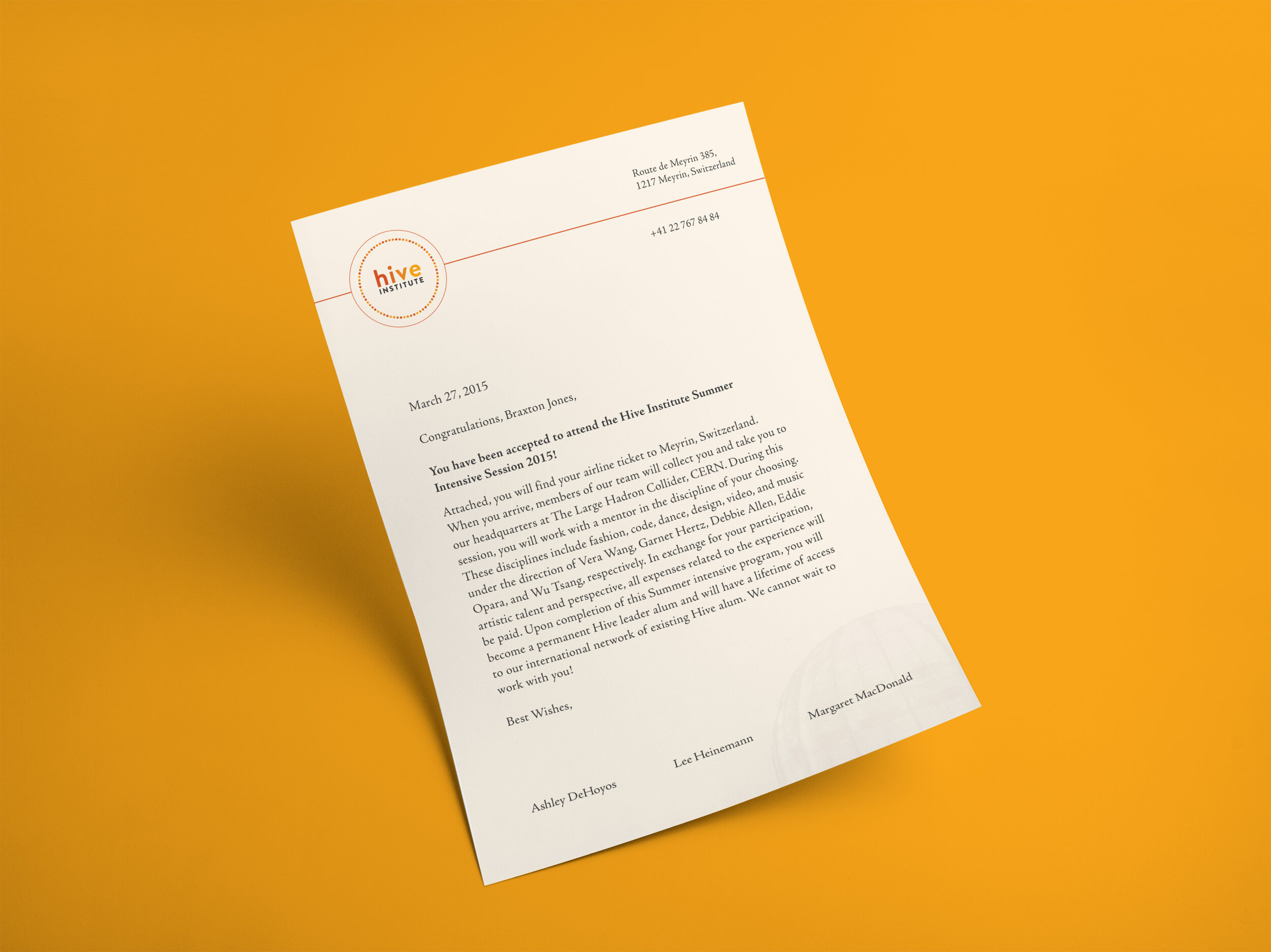
Hive Institute is a hypothetical, intensive Summer school program that selects top-tier middle school students from around the world to come together to immerse themselves in a collaborative, developmental, and artistic learning experience. Students explore their artistic disciplines and their applications to non-artistic disciplines such as math and science. At the end of the program, they are prepared to become artistic leaders in their home communities.


Research & Discovery
Discovery Meeting
Before any design work could begin, I met with the curators to learn more about Hive Institute outside of what they presented in the initial imaginary museum pitch. In combination with the meeting and presentation notes, I consolidated the information into a list of key terms that described the mission, values, and concept of the Hive Institute. See the following terms below:
Activating Spaces
Buzz
Collaboration
Power of Many
Social Activity
Social Impact
Creative Intervention
Incubation
Mobility

Visual Research
I created a visual mood board that was inspired from the key terms above to begin establishing a visual language that resonated with these key terms.
Concept Development
After some exploration with the idea of hexagons, the number 6 and its relation to the pattern tied to bee hives, the Hive Institute's identity made use of scattered circles to represent students as bees in an active, social, and collaborative environment.
Color Palette
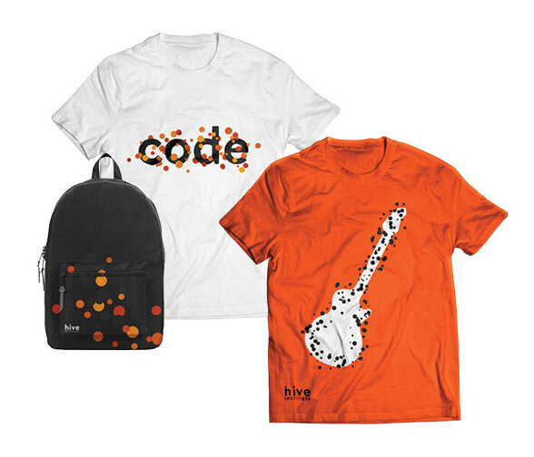
Warm, vibrant colors were used to reinforce the idea of activity and movement amongst the young students and the temperature that comes with the hot Summer months. The vibrancy in the colors were especially important when students were performing and traveling outside of the institute. Using these colors in clothing would help chaparones and guardians identify the students in large crowded areas.
Typography
I selected two typefaces to use in Hive Institute’s brand identity. Brandon Grotesque is used for the primary, secondary, and department logos. This typeface introduces a soft and friendly feel that can be seen in the primary and secondary logos. In contrast, Adobe Jenson Pro is used as both a display typeface and body text.
Logos
The primary and secondary logo uses a soft, friendly approach through its lower case letters and rounded typeface.


To develop the institute's identity I dedicated 6 departments for students to enter for the summer school component. The number 6 was derived from the number of sides on a hexagon, the shape that the bees nest was constructed of. These departments included, Code, Fashion, Design, Music, Video, Dance, all of which had their own branded logo that aligned with the institute's primary and secondary logos.


Brand Applications
The visual brand and identity was applied to various materials to ensure brand recognition and consistency throughout the imaginary museum and any associated activities, events, and merchandise.

Banners would line the streets driving up to CERN to advertise the various departments involved with the museum’s summer program.
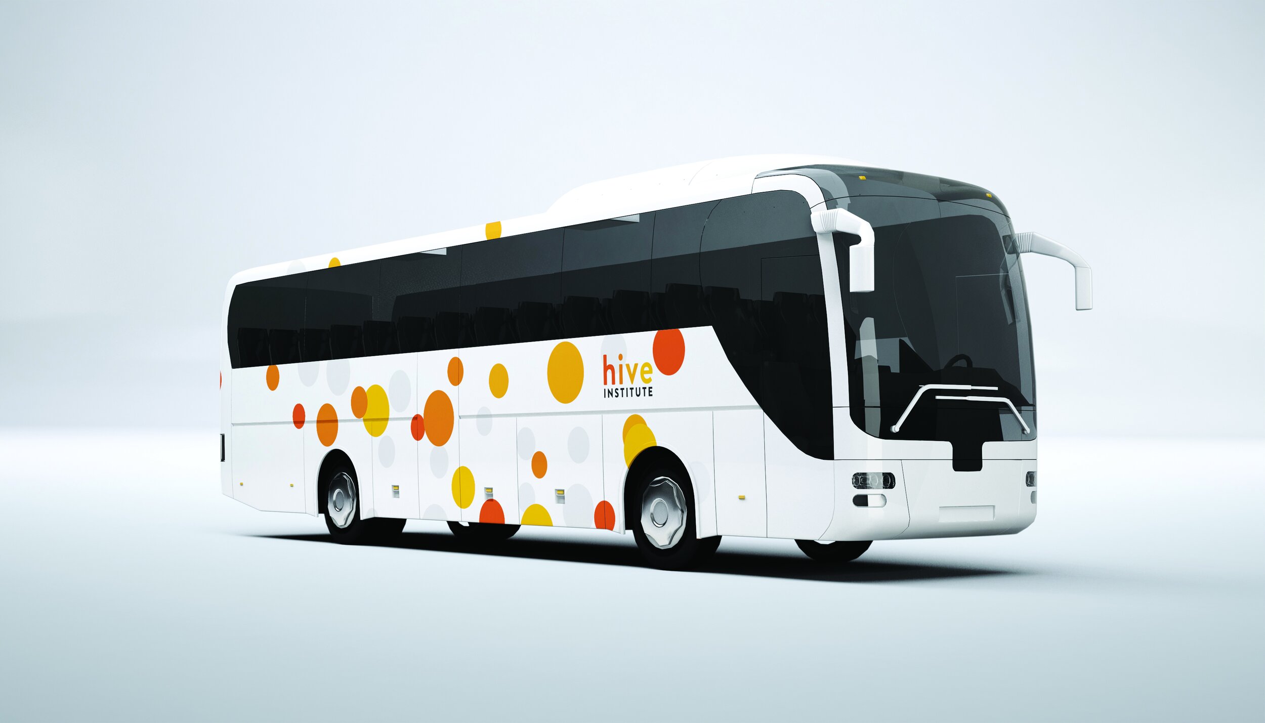
Throughout the summer program, students travel off of the campus to attend events, activities, and to create public performances.

Event poster advertisements for the student’s public performances.
Credits
Curators
Ashley DeHoyos
Lee Heinemann
Margaret Mcdondald
Advisors
Marcus Civin
Ellen Lupton
Jason Gotllieb
Jennifer Cole Phillips